If you have noticed less number of posts in this blog, it is mainly because life, travel and work are impacting my time for blogging. In between I devote my free time to keep my Android apps updated. And partly because I now post my blogs at http://midhunhk.github.io/, which is where you can find my open source projects.
I shall try to make some posts here from time to time, but after discovering an easier way to blog. This is described in my first blog post from github.io - http://midhunhk.github.io/2015/12/30/bye-bye-2015/.
Tuesday, May 31, 2016

Sunday, September 27, 2015
Next Arsenal Match Challenges
NextArsenalMatch was an Android app project that I had done a year back. Dedicated to all Arsenal fans to get the basic information on what and when the next Arsenal match is?
This project was a test attempt into making a live app for Arsenal fans to keep track of the next match. The idea was to use an offline database to store the match details. So for each schedule change, cup exit or cup progress, I had to manually update the database and upload the new build almost every other week as the season progressed.
It seems that an easier alternative to this app can be found on Google Now itself. One can easily track the upcoming match details by adding your favorite sports team. There is as well the official Arsenal Android app which gives more information on Arsenal.

The benefit of developing this app was the contribution of a CopiedDataBaseHelper file for android projects that can use a db file from assets. This file is part of the AeAppsLib.
CopiedDataBaseHelper.java
The canon artwork used for the icon was also created for this project. This is free to use under the Creative Commons Licence.

 |
| NextArsenalMatch |
It seems that an easier alternative to this app can be found on Google Now itself. One can easily track the upcoming match details by adding your favorite sports team. There is as well the official Arsenal Android app which gives more information on Arsenal.
The benefit of developing this app was the contribution of a CopiedDataBaseHelper file for android projects that can use a db file from assets. This file is part of the AeAppsLib.
CopiedDataBaseHelper.java
The canon artwork used for the icon was also created for this project. This is free to use under the Creative Commons Licence.

Sunday, March 01, 2015
Message Counter 3 - Material Design Updates
More design updates come to Message Counter 3. We have implemented the navigation drawer with the sweet animation on the hamburger menu. On popular demand, the Chart is back. The latest update is on a staged rollout.
You can find the current Message Counter app here: https://play.google.com/store/apps/details?id=com.ae.apps.messagecounter
 |  |
You can find the current Message Counter app here: https://play.google.com/store/apps/details?id=com.ae.apps.messagecounter
Sunday, February 15, 2015
Andorid Error : java.lang.NoSuchMethodError: android.View.getMinimumHeight
So I got reports of the error from my Play Store for my app Message Counter.
java.lang.NoSuchMethodError: android.View.getMinimumHeight
In the new build, I had implemented a custom view that reads the min width and height from the xml declaration. The app was working on all the devices that I test. However I did notice that the reports were made from Android devices Version 4.0 or below. Further digging and I found the below solution.
getMinimumHeight() is available in API 16+.
Use android.View.getSuggestedMinimumHeight() instead
It appears that ImageView.getMaxHeight() is also API 16+. Sadly I could not find any alternatives for this one.
Message Counter on Google Play
java.lang.NoSuchMethodError: android.View.getMinimumHeight
In the new build, I had implemented a custom view that reads the min width and height from the xml declaration. The app was working on all the devices that I test. However I did notice that the reports were made from Android devices Version 4.0 or below. Further digging and I found the below solution.
getMinimumHeight() is available in API 16+.
Use android.View.getSuggestedMinimumHeight() instead
It appears that ImageView.getMaxHeight() is also API 16+. Sadly I could not find any alternatives for this one.
Message Counter on Google Play
Wednesday, December 03, 2014
Message Counter 3.0 Beta

Material Love gets extended to Message Counter, after Random Contact. A fresh coat of paint, a new icon and use of some Material Design Principles is a start for the Beta version. This version is code named "Talisman" which follows "Silversun" and "Silvermoon". The updated code is available in GitHub as well.
As per Google Play regulations, only members of a test community are able to test these apps. So the community link is https://plus.google.com/communities/110966372903178356479.
From a technical standpoint, support has been added for AppCompat libraries, replaced ActionBar with a Toolbar. Using Toolbar should extend the experience to users with API less than 11 (Honeycomb). Use of padding, vibrant colors and card view are highlights of this build.
The first thing you will notice from the screenshot below is the use of Cards and a redesigned Counter screen. This will be the "hero screen" for the app.

Note that this is a work in progress and there may be some bugs or issues and do send them in. You can post them in the community or raise issues in the GitHub page for the project.
https://github.com/midhunhk/message-counter
Wednesday, November 26, 2014
Random Contact with Material Design Love
It's been a while since my last blog post, I was obviously busy with my job, life and other important things. In between Android released the latest SDK and support libraries for taking material design to lower versions.
I have been slowly looking at the latest APIs and how to use them in my spare time. Once I was able to get hold of the latest SDK as well as Android Studio, I started to see how I could redesign some apps based on material design principles.
After doing a sample project that made use of all the new features, I started working on redesigning Random Contact app. Firstly this is a simple app, not too complicated in terms of features as well as low volume of users. Second of all, this app has not been updated in a long while. So a little love was on the cards.
Take a look at the new design below.
 It will be interesting to note that the action bar and some text color change dynamically based on your contact's profile image. This is made possible due to a library called Palette which is part of Android. On a technical side, this app uses the following new features from Android.
https://play.google.com/store/apps/details?id=com.ae.apps.randomcontact
The source code for the app is available at github - https://github.com/midhunhk/random-contact
I have been slowly looking at the latest APIs and how to use them in my spare time. Once I was able to get hold of the latest SDK as well as Android Studio, I started to see how I could redesign some apps based on material design principles.
 |
| Random Contact 2.2 |
Take a look at the new design below.
- Recycler View
- Toolbar
- Card View
- Palette
https://play.google.com/store/apps/details?id=com.ae.apps.randomcontact
The source code for the app is available at github - https://github.com/midhunhk/random-contact
Sunday, July 20, 2014
Redesigning the Message Counter App
With the developer release of Android L in June and the introduction of Material design, I've been thinking of redesigning the Message Counter app. Taking into account various principles mentioned and how they can be applied to this app, a few initial design thoughts are shared here.


 So first impressions and suggestions will be very much helpful.
You can find the current Message Counter app here: https://play.google.com/store/apps/details?id=com.ae.apps.messagecounter
Variations on the color scheme are given below.
You can find the current Message Counter app here: https://play.google.com/store/apps/details?id=com.ae.apps.messagecounter
Wednesday, July 02, 2014
Material Design Wallpapers
So Google made the Android L developer preview last week. In a couple of screenshots, they had shown images based on material design and I thought they would look cool as wallpapers. So I created a couple of artworks based on them. You are free to use them as wallpapers or in other creative ways.
 Up above you can see my current home screen, you may be able to spot a widget for MessageCounter which is in development as well. So without any wait, here are 2 images. Click on them for a full screen version and download to use them as you like.
The following images are licensed under Creative Commons license. http://creativecommons.org/licenses/by-sa/3.0/. You are free to use these images subject to the terms of this license.

Material design Wallpapers by midhunhk is licensed under a Creative Commons Attribution 4.0 International License.


Update: One more artwork is here. This one is my current wallpaper.

Watch out for more updates.
Update 2: The complete wallpapers and as well as future updates can be found at : https://plus.google.com/photos/114665288998361746888/albums/6121148941176472961
The following images are licensed under Creative Commons license. http://creativecommons.org/licenses/by-sa/3.0/. You are free to use these images subject to the terms of this license.
Material design Wallpapers by midhunhk is licensed under a Creative Commons Attribution 4.0 International License.
Update: One more artwork is here. This one is my current wallpaper.
Update 2: The complete wallpapers and as well as future updates can be found at : https://plus.google.com/photos/114665288998361746888/albums/6121148941176472961
Sunday, June 08, 2014
RoundedImageView in Android
The contact picture as it appears in Google+ inside a circle was part of the redesigned Random Contact app at the play store.
The solution was to create a custom View "RoundedImageView". Developed with help from stackoverlow.com, the custom view is released as an open source component that anyone can reuse.
 |
| RoundedImageView usd in Random Contact app |
This file is a part of the ae-apps-library project.
Source for RoundedImageView at https://github.com/midhunhk/
Saturday, May 24, 2014
PNR Status App
Finally the PNR Status App for Android was released on the Google Play Store a few weeks back. The latest version is 3.2 codenamed Marvin.
Don't worry about keeping track of your PNR Number or enter it each time you want to check the status. Use this app to store your PNR Number and check the status easily.
You can see a sorted list of ticket message details sent as confirmation for easily accessing your booking information.
Features:
- Follows Android Design principles
- High quality graphics and icon
- Multiple services to choose from
- Detailed PNR information
- Shows ticket information from IRCTC's SMS
- No Advertisments
- Free
- Open Source
Screenshots
Did I mention that this app is designed for tablets as well?
This application is open source and free to use. The source code can be found at the following GitHub location. https://github.com/midhunhk/pnrstatusapp . Feel free to browse and
Find out more app details from https://www.facebook.com/AeAppLabs
Play Store Link: https://play.google.com/store/apps/details?id=com.ae.apps.pnrstatus.v3
Don't worry about keeping track of your PNR Number or enter it each time you want to check the status. Use this app to store your PNR Number and check the status easily.
You can see a sorted list of ticket message details sent as confirmation for easily accessing your booking information.
Features:
- Follows Android Design principles
- High quality graphics and icon
- Multiple services to choose from
- Detailed PNR information
- Shows ticket information from IRCTC's SMS
- No Advertisments
- Free
- Open Source
Screenshots
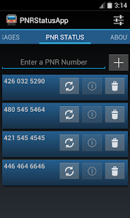 | 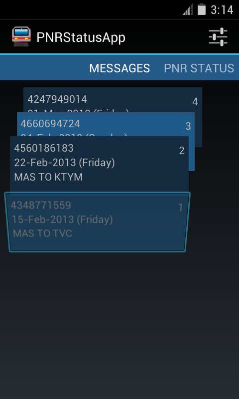 | 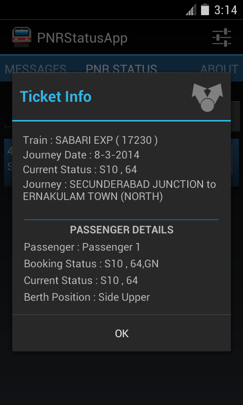 |
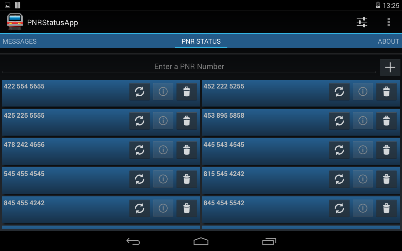 |
| On a 7 Inch Tablet |
This application is open source and free to use. The source code can be found at the following GitHub location. https://github.com/midhunhk/pnrstatusapp . Feel free to browse and
Find out more app details from https://www.facebook.com/AeAppLabs
Play Store Link: https://play.google.com/store/apps/details?id=com.ae.apps.pnrstatus.v3
Friday, January 17, 2014
Retracing the travel in Dan Brown's Inferno - Part 1

Having played Assassins Creed 2, which is also set in Florence reminded me of places that I had seen and ran (albeit, set centuries ago).
After completing the book, I learned about the Google Map Engine. An app where we can create custom maps. So I began this project of marking the places in the order that the characters took.
Because of time constraints and other commitments, I couldn't complete and share the Part 1 soon enough. Anyways, better late than never.
Part 1 of this project is completed and shared below. Have a look at it if you intend to read it. I will continue to work on Part 2.
https://mapsengine.google.com/map/edit?authuser=0&hl=en&mid=zqsMFuWb0NmE.koenj4cBUSA4
Thursday, December 12, 2013
Disable Dashboard on Start Up in Spring Tool Suite

If you are a new user to the Eclipse based IDE Spring Tool Suite (STS). If like me, you are getting annoyed when the Dashboard opens up every time the application is started, this is how you can disable it.
After some research and some searching through the preferences, I finally found out how to get it done on the latest version of STS (3.4.0 the one I am using now). Apparently they moved this around from previous versions.
In the STS application, navigate to "Window -> Preferences", and start typing "Dash" inside the text box located at the top left. Click on the "Dashboard" item and uncheck the "Show DashBoard On Startup" item on the right. Click "Apply" and "OK".

You can look at the above image to see how the preference screen for this will look like. Once done, the DashBoard should be gone for ever, unless you want it back in which case you can bring it back by checking the same option in the Preference.
Thursday, November 21, 2013
Design evolution of Random Contact app
Background
Just this week I published an app on Google Play Store called Random Contact. It all started when I was learning the Android Contacts API. I wanted to make an app myself that made use of the Contacts API so that I could learn and see it working in a real environment. Especially as I had a Google Nexus S, it was even more an incentive to develop and experiment my own apps and see them running on my phone.
Random Contact
 So that was the reason for developing this app. There seemed no point in making another contacts app as the stock(default) one was very good and many third party apps available. So I thought of making an app that shows a random contact details. It has a surprise element to it.
Warning: This app is not meant to be a replacement for your Contacts / Dialer app. This is a fun app with no real use. The main reason this app is considered as part of "Useless Apps" internally.
The development started with an old version of Android API (2.2 to be precise), so I wasn't keeping in mind the latest design guidelines and the result was an ugly looking app with very little user experience
Redesign and Rewrite
After the Holo design came out solid Android Design guidelines became the De-facto standard, I went about researching on how to create a better User experience (UX) keeping in mind that this app has no special value to a user.
After going through brainstorming and multiple drawings on paper, came up with the new design. And in keeping with the time, rewrote most of the code against Android 4.3 APIs and is now available on the Play Store. Along the way some optimizations and new features were added.
Few people might have seen the original app, so below you can find a screen shot of initial screen, design on paper and the present day app.
Apps Library
I will touch on this in a future post, but one of the side effects of development this app was an Android library app that I created which makes use of mostly my research and studies. This will be an ever growing library which is open sourced and publicly available on GitHub. Any new Android projects can make use of this library to achieve similar functionality.
Try out the app
So if you are still interested in checking out this app, follow the link below to get it from the Play Store.

Just this week I published an app on Google Play Store called Random Contact. It all started when I was learning the Android Contacts API. I wanted to make an app myself that made use of the Contacts API so that I could learn and see it working in a real environment. Especially as I had a Google Nexus S, it was even more an incentive to develop and experiment my own apps and see them running on my phone.
Random Contact
Warning: This app is not meant to be a replacement for your Contacts / Dialer app. This is a fun app with no real use. The main reason this app is considered as part of "Useless Apps" internally.
The development started with an old version of Android API (2.2 to be precise), so I wasn't keeping in mind the latest design guidelines and the result was an ugly looking app with very little user experience
Redesign and Rewrite
After the Holo design came out solid Android Design guidelines became the De-facto standard, I went about researching on how to create a better User experience (UX) keeping in mind that this app has no special value to a user.
After going through brainstorming and multiple drawings on paper, came up with the new design. And in keeping with the time, rewrote most of the code against Android 4.3 APIs and is now available on the Play Store. Along the way some optimizations and new features were added.
Few people might have seen the original app, so below you can find a screen shot of initial screen, design on paper and the present day app.
 |
| Left : First version, Middle : redesign on paper, Right : Completely redesigned UI |
Apps Library
I will touch on this in a future post, but one of the side effects of development this app was an Android library app that I created which makes use of mostly my research and studies. This will be an ever growing library which is open sourced and publicly available on GitHub. Any new Android projects can make use of this library to achieve similar functionality.
Try out the app
So if you are still interested in checking out this app, follow the link below to get it from the Play Store.
Wednesday, November 06, 2013
RandomContact - New App Announcement
After being in an internal Proof of Concept project, one more Android app will soon be seen by the external world. I was learning to work with the ContactsContacts API. This API is a contract between the Contacts provider and applications.

Most of the code related to accessing the API is done as part of a library project called aeappslibrary, the code for which is open source and already available in GitHub. This library can be reused by other projects to work with the API. There have been hours spent on studying the API while developing this library. MessageCounter is an application that already utilizes this library.
It was near the end of 2012 that I started learning about the Android's ContactContract API. In order to learn the various parts of the API, I decided to create an Android App. That turned out to be a simple app called Random Contact. The UI was very basic and not very attractive - the sole reason it has lived its life as an internal app.
The Random Contact application shows you a Contact randomly picked from your contacts list. It will list all the contact numbers and easily allow you to call or text them. Other details that we can get using the API are the times that person has been contacted and the last date of contact. While you may think these features as boring, we think there could be fun uses.
When can you see the app live? Work on version 2, a completely redesigned version, is on steroids for the past few days. As much as the challenges are exciting, I shall provide here, for the first time, an internal road map for any app's development. A Beta release on Google Play is not too distant as of now.

The source code for this app is expected to be released under Apache Licence Version 2.0 on GitHub.
With the supported features as explained earlier, I would appreciate to see some rough drawings on how you expect the UX for the app.
Wednesday, October 23, 2013
Age of Logo Redesign
The past few months have seen some slight to major redesigns of some major websites. The fact that these have come months apart maybe a coincidence.
Google Logo

The new Google design including logo was mentioned in this post earlier. Above you can see the old logo on the left with the updated flat style logo to its right. The change was from a logo with 3D look with shadow to plain and flat look.
Yahoo Logo

It all started when Yahoo! CEO Marissa Mayer announced a "30 days of Change", with a new logo for 30 days. At the end of which Yahoo! released their new logo - the same Yahoo and an exclamation mark as shown above. It can easily be noted that the logo has slimmed down and they have used a sans serif font instead. The old logo looked funky, but the new one sporting a darker purple has an elegant look. You can also see it has a slight 3D look and feel to it.
Bing Logo

Bing - Microsoft's answer to Google was the last to do the overhaul. But the change to Bing is more vivid. They have a new logo, which looks like Google Drive's. Then the font has been simplified to follow the new Microsoft logo. And at last it is all golden color now from a blue shade.
In a space of few months, some major websites have tinkered with their logos. What do you think of these changes?
Google Logo
The new Google design including logo was mentioned in this post earlier. Above you can see the old logo on the left with the updated flat style logo to its right. The change was from a logo with 3D look with shadow to plain and flat look.
Yahoo Logo
It all started when Yahoo! CEO Marissa Mayer announced a "30 days of Change", with a new logo for 30 days. At the end of which Yahoo! released their new logo - the same Yahoo and an exclamation mark as shown above. It can easily be noted that the logo has slimmed down and they have used a sans serif font instead. The old logo looked funky, but the new one sporting a darker purple has an elegant look. You can also see it has a slight 3D look and feel to it.
Bing Logo
Bing - Microsoft's answer to Google was the last to do the overhaul. But the change to Bing is more vivid. They have a new logo, which looks like Google Drive's. Then the font has been simplified to follow the new Microsoft logo. And at last it is all golden color now from a blue shade.
In a space of few months, some major websites have tinkered with their logos. What do you think of these changes?
Wednesday, October 16, 2013
Tips on Improving Productivity with Eclipse

For many tasks Eclipse IDE provides a key board shortcut of some type. When working with medium to large projects, I find using keyboard shortcuts to be a significant time saver. They let me find or get things done very fast. Compared to using a menu option or using the mouse, key board shortcuts can improve one's productivity.
| ShortCut | What it Does |
| F3 | Open Declaration |
| CTRL + SPACE | Auto Complete |
| CTRL + D | Delete current Line |
| CTRL + G | Search for declaration in Workspace (after highligting a word) |
| CTRL + L | Jump to Line Number |
| CTRL + O | Quick Code Outline/ Structure |
| CTRL + T | Open Heirarchy |
| CTRL + E | Swicth Editor |
| CTRL + Q | Last Edit Location |
| CTRL + SHIFT + R | Open Resource |
| CTRL + SHIFT + I | Inspect (Evaluate an expression while in debug mode) |
| CTRL + SHIFT + P | Find matching brace |
| CTRL + SHIFT + L | Key Assist |
Bonus Tip
Double clicking to the immediate right of an opening brace selects all the code between two braces.
Feel free to add any more shortcuts in the comments.
Saturday, October 12, 2013
Aim of Google redesign
This post is my speculation on the aim for the latest Google navigation redesign.
The ugly black navigation bar at the top of the Google Home Page was pretty difficult to use with touch devices like smart phones or tablets. So this could be a reason for coming up with the App Launcher.

One more thing that I would like to add is the tabs in Google Image search, although they are just text the extra spacing between lets the user choose what they really want.

The ugly black navigation bar at the top of the Google Home Page was pretty difficult to use with touch devices like smart phones or tablets. So this could be a reason for coming up with the App Launcher.

With the App Launcher, it becomes easy with a touch based interface to go to that application faster.
Its true that most of the buttons in Google applications are bigger and space around them so as to be easy to touch without having to worry about clicking on something else.
 |
| Buttons in Blogger |

If you have any other views, feel free to add in the comments.
Sunday, September 22, 2013
New Google Logo and Navigation bar
Google is starting to rollout a new logo and navigation bar.
Ironically the new logo looks flat and simple - following the iOS7 paradigm.The previous logo is shown below. For now some people might see the old logo, but I guess they are rolling the changes slowly, probably looking for early feedback from the users.
And the much disliked black band across the top with links to all Google services is gone. It is now replaced with an App drawer button.Next to the Sign in button below, you can see what looks similar to the Android app drawer button from which you can launch google apps.
Check if you are able to see the new design..
 |
| New Flat Google Logo |
Ironically the new logo looks flat and simple - following the iOS7 paradigm.The previous logo is shown below. For now some people might see the old logo, but I guess they are rolling the changes slowly, probably looking for early feedback from the users.
 |
| The old logo |
 |
| New home page with app drawer. |
Sunday, August 04, 2013
Opera

Long time followers if this blog might know the fact that I have a particular soft corner towards the web browser Opera. (One among a few percent of opera fans in three world, I guess).
Opera has always been the innovation maker in the field of web browsers. I started using opera (version 7 or 7.5) at a time when internet explorer had killed off Netscape and a budding Firefox was in the market. It will be difficult to convince me that Firefox is a superior browser but I will choose it any day over Internet Explorer. IE is in my case gives the worst user experience. IE has successfully made a bad name for itself that even when sone reviews say version 10 and 11 are good and stable, I no longer bother.
So taking about Opera's innovations, I think it was the first browser to offer multiple tabs. That was very ingenious and useful. Other browsers followed and IE in particular took a long time to implement.
Mouse gestures, voice control (you can ask Opera to item a new tab etc.) Themes, plugins / extensions (not sure if opera or Firefox was first for these).
For a long time I never saw Google's home page thanks to Opera, as I could do all my searches from the


Opera introduced a new menu system, which was straightaway copied by Firefox. This dispensed with the normal menu system on old windows and added an Opera button at the top left which opened down the main menu.
Opera included a mail client (removed in version 15), a torrent down loader, integrated notes, password manager (which is encrypted, I learnt that Firefox used to store them encrypted).
A couple of features exclusive to Opera are Turbo which speeds up browsing on slow networks.

Later came Speed Dial, Tab Stacking, Private browsing and private tabs (I haven't seen private tab in any other browser yet), ability to pin tabs etc.
The most striking innovation that I felt useful as a Web Developer was "Opera Dragonfly". It was the first time that such a tool was available to see how web pages are handled by browsers.
The list is almost endless with the features given by Opera, that it would easily over whelm a novice user. Still I recommend using Opera as your secondary browser, if you prefer using Chrome or FireFox as your primary one.
Check out InFewBytes on Facebook or Opera : InFewBytes for more tips on using Opera. Opera offers a lot of stuff under the hood which might baffle a new user, so look out for tips and tricks from the e-book mentioned in the above link.
Additional Read
Check out the Best Desktop Browser and Opera 10 Alpha for other posts on Opera in this blog.
Additional Read
Check out the Best Desktop Browser and Opera 10 Alpha for other posts on Opera in this blog.
Message Counter 2: Open source android app
Message counter 2 is an open source android app which displays the count of sms received from each contact. The development on this app is basically for educational purposes
 |  |
The latest update includes features, improvements and optimizations. As well as experimental support for French language.
Download the Android app from the Play Store.
Subscribe to:
Posts (Atom)